Mapping ES provision using Service Area Analysis
Exercise I: Preparation and first assessment
Service area analysis is useful in evaluating accessibility of locations. Given locations of fire stations, hospitals, public transit stations etc. you can use such analysis to identify what areas can be served from these locations by either amount of distance travelled or by time taken. This accessibility analysis is of high relevance for green space planning as it allows to estimate the potential population around a given distance or walking time from UGS based on the street network.
Setup
Till recently, such analysis was difficult using open-source tools and data. But now we have access to a global street network using OpenStreetMap (OSM) and free web-services such as Openrouteservice (ORS) that can perform complex routing tasks using OpenStreetMap (OSM) data. We will use the ORS Tools Plugin to perform service area analysis in QGIS. Therefore, we will use entry points for urban green space (UGS) in the city of Leipzig to determine service areas. Openrouteservice API provides routing algorithms that work on free geographic data from OpenStreetMap. It is a free web-based service that can be accessed via a QGIS. While the service is free, it requires you to sign-up and get an API key in order to prevent abuse and enforce limits on usage. Please follow steps 1 to 5 in the section Setup of this tutorial for setting up the ORS tool in QGIS: http://www.qgistutorials.com/en/docs/3/service_area_analysis.html
Get the data
- Download the data that refers to your name (the group number that matches your name in the https://box.hu-berlin.de/f/3371166cf6fc44059b11/ here: https://box.hu-berlin.de/d/cf49b4997a674efda182/.
- Download population data that is needed for Part 2 from here: https://box.hu-berlin.de/f/fc46d602c614496a997f/
- Proxies used: The share of forest area on UGS indicate potential ecological functions e.g. a good habitat function and therefore biodiversity potential of the corresponding area. The population pressure on UGS, calculated by the population per m², is indicating crowding effects, but also the potential for social gathering and cohesion of the corresponding UGS.
Exercise II: Calculating Service Areas
Add the data on UGS and entrance by navigating to the corresponding folder and drag and drop it to the canvas. To see this in the context the data that was used to generate them, we can add the OpenStreetMap basemap. Scroll down the Browser panel and locate
XYZ Tiles -> OpenStreetMap. Drag it to the canvas.Now we are ready to start the network analysis. In the Processing Toolbox, search for and locate the
ORS Tools -> Isochrones -> Isochrones From Layertool. Double-click to launch it. Selectopenrouteserviceas the Provider. We will be computing a 15-min walking distance polygon from each entrance. SelectEntranceas Input Point Layer. SelectPolygon_IDas the Input Layer ID Field. From the Travel mode drop-down, selectfoot-walking. As we are interested in time-based area, selectdistanceas the dimension. Finally enter300meters as the ranges. Click Run.
Note that the Openrouteservice API has a limit of 20 requests per minute for Isochrones. So, if your layer has more than 20 points, you may see errors indicating that the rate limit exceeded. You can keep the tool running and it will continue processing 20 points / min. For 800 entrance points and the chosen settings the calculation will take ~60 minutes.
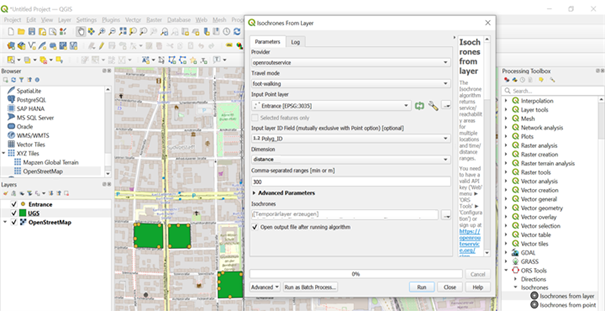
Why 300 meters? Check the 3-30-300 rule here: https://www.milford-global.com/articles/the-3-30-300-rule-for-greener-cities.
Once the tool finishes, you will see a new layer Isochrones loaded in the Layers panel. Each point has an associated polygon representing the area that is accessible within 300 meters by walk. You will see that the polygons are not circular, because the travel distance is computed along roads, so the regions that have no roads will have lesser area covered. Export the layer in order to have the created file for the Isochrones permanently. Note that we discovered the following issue: When you try to safe the layer directly from the tool (by indicating a direction of saving the layer) it might happen that the layer is not saved. Instead, let a temporary layer to be created and export it to your directory afterwards.
- To compute the service area, we need to complete one last task. We can merge individual isochrone polygons to form a single polygon representing the areas that are accessible. This is needed as one urban green space (UGS) can have multiple entrances, but the final service area should just be one single area. Search for and locate
VectorGeometry -> Dissolve. SelectIsochronesas the Input layer andPolygon_IDas Dissolve field. In order to have the created file for the Isochrones permanently, indicate a folder in which the file can be saved. Click Run. Once the processing finishes, a new layer Dissolved will be added to the Layers panel. This polygons represents the full region that is accessible from the metro system within 300 meters of walk.
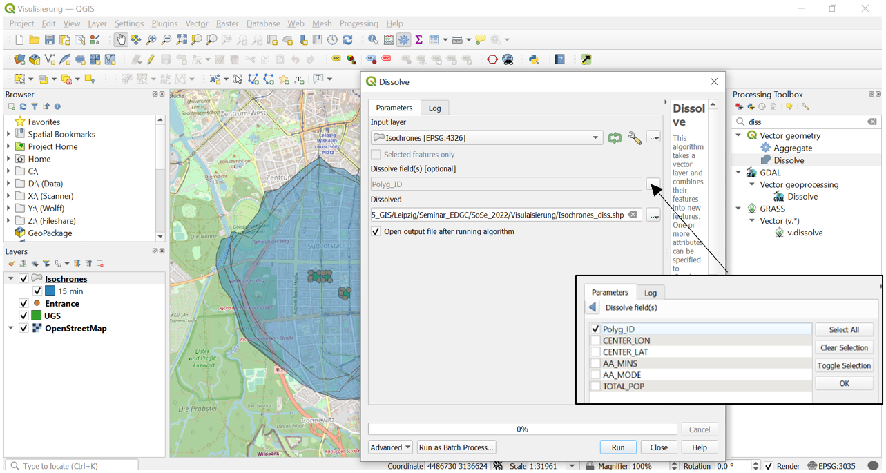
- Repeat the calculation of Service Areas for with the same settings but for the mode
wheelchair.
Exercise III: Calculating population pressure
In order to estimate the potential population pressure on each UGS based on the surrounding isochrones we need to combine the calculated polygons with the population count of the surrounding buildings. Population pressure is defined as the population within a defined surrounding (in our case 15min walking distance) per m² of a related urban green space (UGS).
- Load Buildings. Search for and locate
VectorOverlay -> Intersection
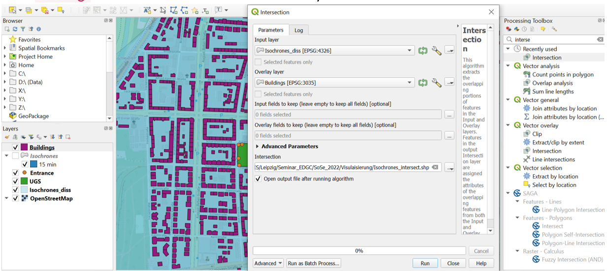
- The intersection procedure returns the correspondence between buildings and isochrones. Based on the intersected polygons we need to recalculate the population count based on the assumption that population is distributed equally within the same polygon (this is indicated by the population density
Pop18weighin the shapeBuildingsindicating the population per m² building footprint). This procedure is required for buildings being cut by different isochrones and prevents double counting of population figures. Therefore, open the attribute table of the shape Intersection, open the Field Calculator and calculate a new field.

- Finally, we need to sum up the recalculated population number for each UGS polygon using the attribute PolygonID. Use the procedure Aggregate as shown below.
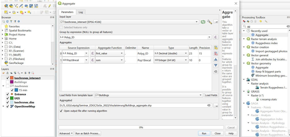
- In a final step, we join the statistic with the `
UGSfile. Navigate to Vector general Join attributes by field value. UseUGSas input layer andBuildings_aggregateas input layer 2. UsePolygon_IDas table field for both inputs.
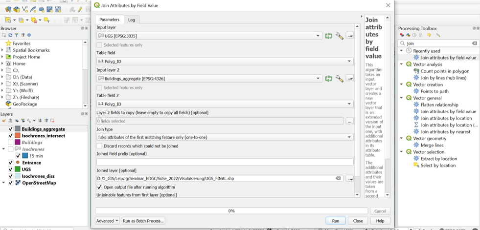
- Now that we have the population estimate within each service area joined with the
UGSareas we finally relate the population count to the individual area of the UGS in order to be able to compare the resulting values across the study area. In the final layer open the attribute table and the field calculator and calculate the attributePopPressure. The resulting value indicate how many people would potentially concentrate on 1m² of the corresponding UGS.
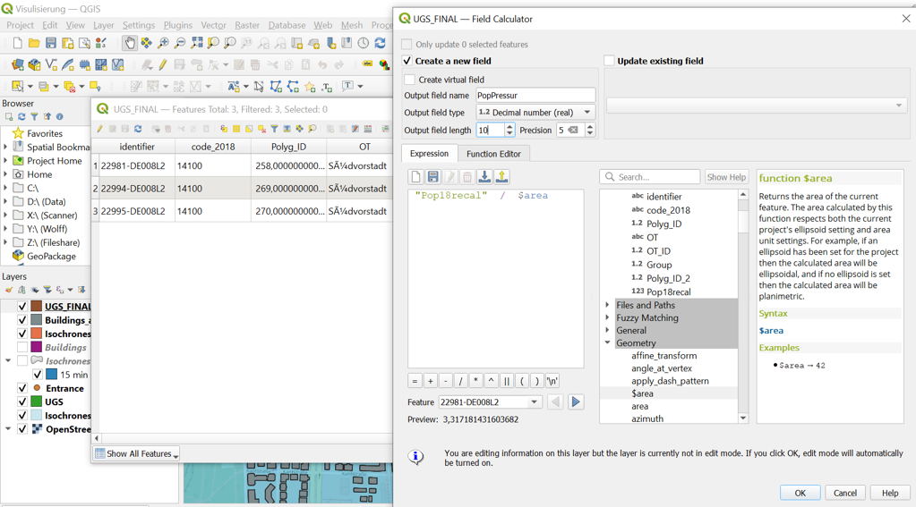
Exercise IV: Output development
In this part we finally produce the outputs for the Lab report responding to the following questions.
- Map visualization (No screenshots of your QGIS project!): Chose a style, layout, colour range etc. which most effectively display your individual results or differences between results (see point 3 below). Create your own map(s) and export it for your report. Here you find some help:
- http://www.qgistutorials.com/en/docs/3/making_a_map.html
- https://docs.qgis.org/3.4/en/docs/training_manual/map_composer/map_composer.html
- https://www.youtube.com/watch?v=jDzgKphvTho
- Produce a graph (e.g., scatterplot) which contrasts the given share of forest cover in field
WoodySharein shapeUGSto the calculated population pressure for each UGS. You can produce more graphs of meaningful results if you like. You can use any software for that (e.g., R, MS Excel, QGIS plugin Data Plotty). For exporting the data table see screenshot below:
