- Learning goals
- What is raster data?
- Remote sensing resolutions
- Sensing light
- Contrast enhancement
- Assignment
- True- & false color RGB-composites
- Visualizing surface types
- Submission
- Test for Session 3:
terra-package
2. Image properties I
Learning goals
- What is a ‘raster’?
- Recap the “remote sensing resolutions”
- Get introduced to image/raster visualization in QGIS
- Explore how different land cover types behave in “true-” and “false-colour” visualizations
What is raster data?
A quick warm-up of your GIS knowledge. The two most popular spatial data formats are vector and raster data. Digital images - including remote sensing imagery - are stored in rasters.

A raster is a matrix of cells (pixels) organized into rows and columns.
We describe raster data along certain image properties:
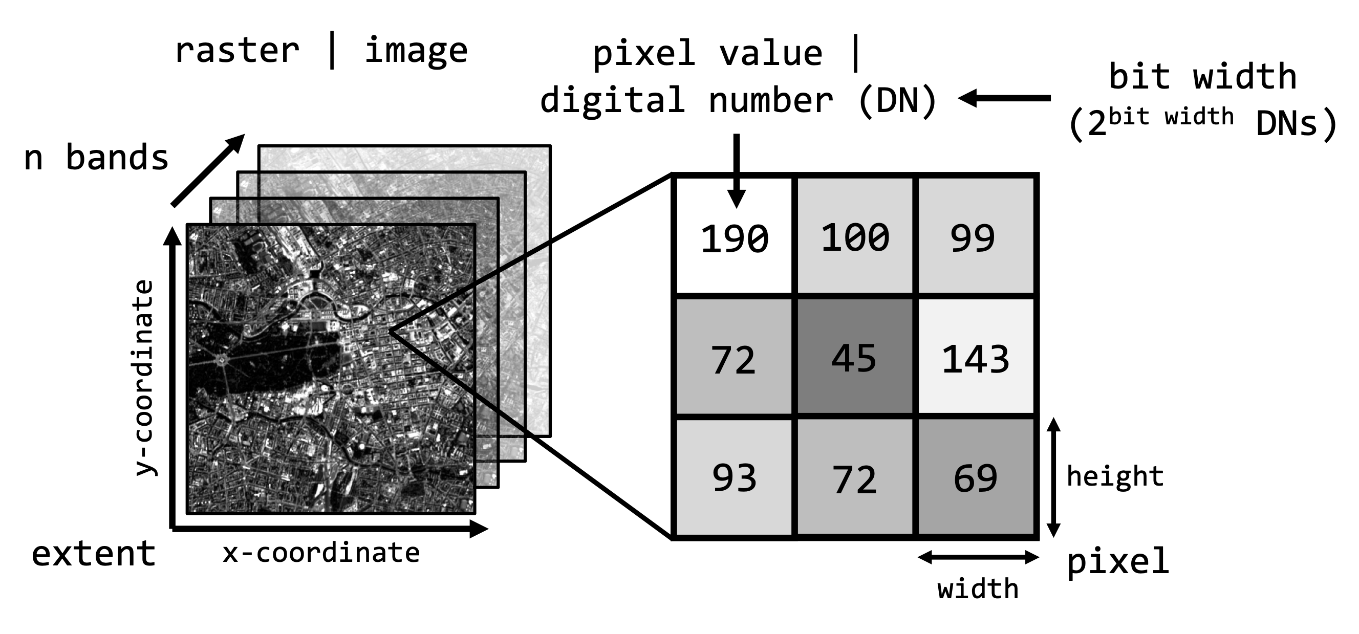
Images recorded with our normal cameras and phones are organized in the same way as shown above. However, some properties (spatial extent, pixel resolution, …) are unqiue to spatial raster data (since it is georeferenced data).
You are familiar with common image formats such as .jpg
or .png. Generally, there are hundreds of different
image formats (see gdal.org), most common image
formats regarding digital remote sensing imagery are illustrated in the
table below:
| Format name | Extension | Description |
|---|---|---|
| GeoTIFF | .tif, .tiff, .gtiff | TIFF + geospatial reference |
| ENVI | generic, often used in imaging spectroscopy community; Header file (.hdr) with meta data! | |
| JPEG2000 | .jp2, .j2k | used by many data providers; usually for integer values only |
| HDF4, HDF5 | .hdf, .h4, .hdf4, .h5, .hdf5 | hierarchical data format, version 4 or 5; multi-resolution raster |
| netCDF | Network Common Data Format; multi-resolution raster | |
| SAVE | Standard Archive Format for Europe e.g. Sentinel-1 and Sentinel-2 |
The by far most common format used is the geospatial Tagged Image
File Format or GeoTIFF. What is important for data
formats when dealing with geospatial raster data is the ability to store
spatial metadata and (usually) to save the data lossless to disc,
i.e. the original recorded data is not manipulated or lost due to heavy
compression (e.g. .jpg is therefore not a suitable format
for remotely sensed data).
Many of the properties mentioned above are determined or influenced by the sensor system we record the data with. In the context of remote sensing this largely relates to the major resolutions of the sensor system.
Remote sensing resolutions
Recall from the lecture, that remote sensing sensor systems can be broadly characterised by four resolutions:
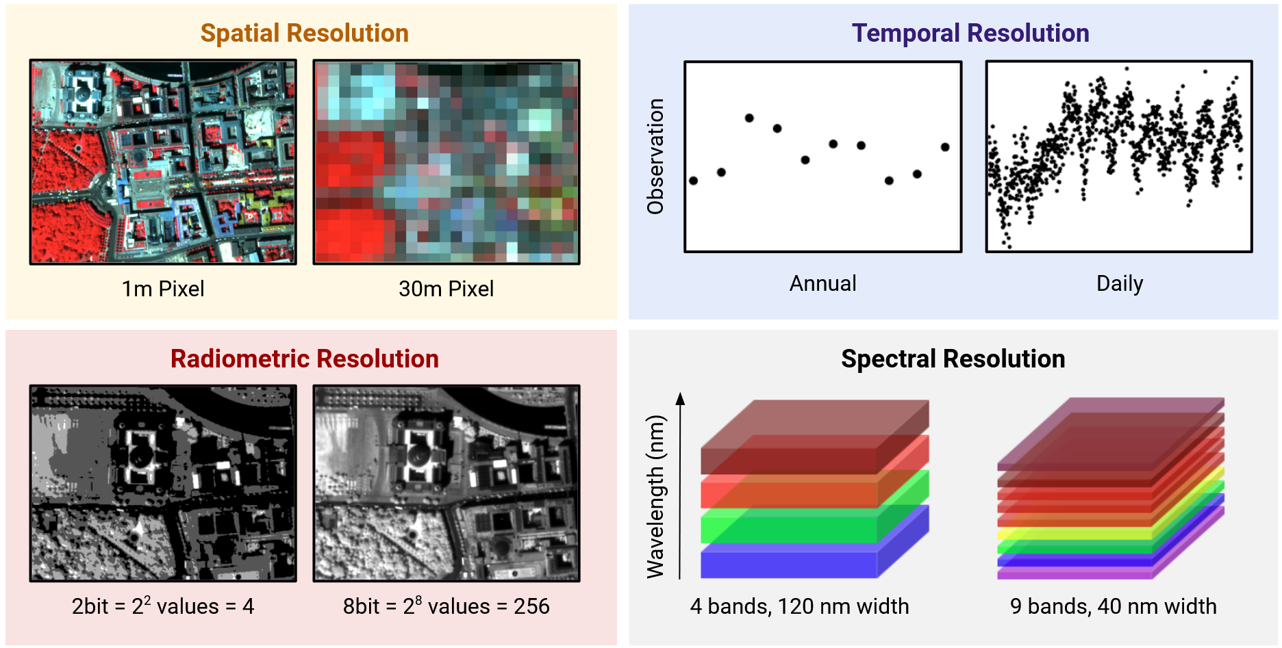
- The spatial resolution describes the length of one side of a single image pixel. Often, the term ground sample distance (GSD) is used interchangeably, which describes the distance between two adjacent pixel centers measured on the ground.
- The temporal resolution is the interval between two observations of the same spot on Earth. Note: There is a trade-off between spatial and temporal resolution as such that finer spatial resolution leads to lower observation density
- The radiometric resolution describes the range and discernible number of discrete gray values a sensor can distinguish. The radiometric resolution is measured in bit (binary digit). The radiometric resolution governs the datatype that needs to be used (we take a closer look at this in the next session)
- With spectral resolution we often refer to the width and number of spectral bands in the sensor system. Technically, it refers to the width of the wavelength interval of individual bands.
Unique sensor resolutions may then directly result in specific image properties as shown above. For instance, the ‘OLI’ sensor onboard the Landsat-8 satellite measures large parts of the electromagnetic spectrum with a GSD of 30 meters. Accordingly, the default pixel width and height of the projected raster data is 30 meters.

In order to easy the navigation in the relatively coarse Landsat imagery, you can add Web Map Services (WMS) such as the Google Satellite layer or OpenStreetMap to QGIS. This can help you with identifying objects in greater spatial detail. To do this, simply navigate to
XYZ Tiles section in the Browser window
(default: center-right), right-click and select
New Connection, name it Google Satellite and
put
https://www.google.cn/maps/vt?lyrs=s@189&gl=cn&x={x}&y={y}&z={z}
into the URL box. Then, simply double-click onto the new connection to
add it to your map view.
Exercise
It is time for our first hands-on on some raster data. We will use
QGIS for this. Navigate to the sub-folder
Landsat-8 inside the data folder for today’s session.
Inside this folder are two files. Both share the obscure name
LC08_L1TP_193023_20190726_20200827_02_T1_int16. Do not
worry about the name for now. All that matters is that this is data
recorded by Landsat-8. Chances are very high you have looked at
Landsat data before when using Google Earth.
- In which data format is the image stored?
- Right-click the file and open the properties. Is it possible to retrieve metadata such as the spatial resolution from the file?
Next, open QGIS and read in the Landsat-8 image, either by clicking
 in the top-left panel or simply by
draggin-and-dropping the file in the central map-window of QGIS.
in the top-left panel or simply by
draggin-and-dropping the file in the central map-window of QGIS.
- Where on earth are we?
- How does the image appear (colour)? Recall from the lecture that we can differentiate between true- and false-colur image visualization. What is your guess we are looking at by default? Hint: Take a look at the roof tops and the fields surrounding Berlin.
Now that we have clarified that remote sensing images are stored in rasters which come with specific properties and are stored in certain data formats, let us recap from the lecture how our eyes and digital photography sense light.
Sensing light
The human eye
In many ways, imaging sensors resemble the human eye - we can describe it as a ‘sensor with three bands’.
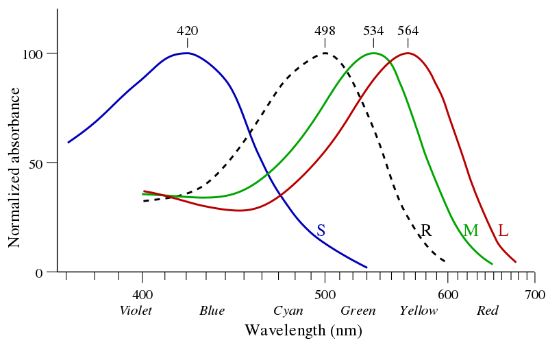
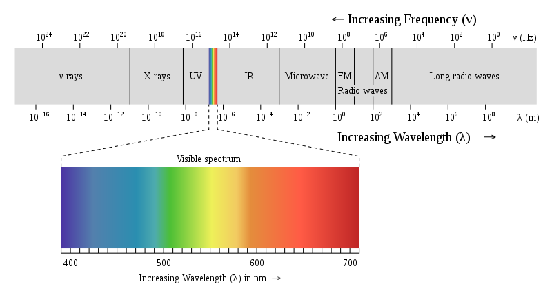
The human eye is sensitive for electromagnetic radiation in the visible domain, meaning the blue, green and red regions of the electromagnetic spectrum. We can say the human eye is sensitive between ~400-700 nm, which is defined as the spectral range in the context of remote sensing. The human eye consists of three receptors cells (cones) for color vision, which respond to light of shorter (S), medium (M) and longer (L) wavelengths regions. The perception of colors depends on the stimulation of these cones, e.g. red is perceived when the L cone is stimulated more than the other cones. The width of the response curve of each receptor at half of the maximum sensitivity (peak) is defined as the spectral resolution, the intervals between the maximum sensitivity between receptors corresponds to the spectral sampling interval in the context of remote sensing.
Digital photography
Photos taken in the visible domain and displayed as we perceive it with our eyes are called true-colour images. The recording of light in the different wavelength regions (blue, green, red) is realized separately, i.e. the magnitude of reflected light (0-100%) is captured and stored separately in an individual image (or band). Standard digital cameras therefore represent imaging sensors with three bands:
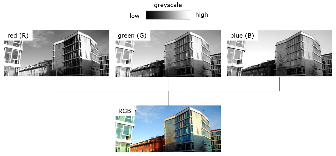
Above a photograph of the Geography Department as RGB visualization and separated in its red, green, and blue band. Every band can be visualized on a grayscale from black (low values = low light intensity) to white (high values = high light intensity). You may notice that the blue sky appears brightest in the blue band, while the red facade of the old building appears brightest in the red band. Accordingly, when we combine the three single-band images into one RGB multi-band band image as shown above, the combined relative magnitude of each band consitutes to the overall colour of the objects.
Optical remote sensing
Now to optical remote sensing systems, or often also called imaging spectrometers. In essence, these are simply fancy cameras. Imaging spectrometers are capable to record light beyond the human eye’s sensitivity. Depending upon the wavelength region of the electromagnetic spectrum the sensor records, we differentiate between three major domains of remote sensing:
- Optical remote sensing observes the visible light (VIS; ~380 - 700 nm), the near infrared (nIR; 0.7 - 1.3 µm) and short-wave infrared (swIR; 1.3 - 3 µm)
- Thermal remote sensing observes thermal infrared radiation (tIR; 5 - 15 µm)
- Radar remote sensing observes microwave radiation (1 mm - 1 m)
In this course we are focusing on optical remote sensing. Images obtained from sensors in this domain therefore usually have bands in the visible VIS, near-infrared (nIR) and shortwave-infrared (swIR).
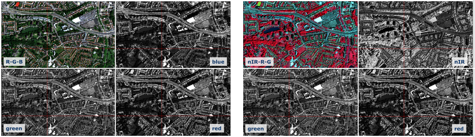
We can use the visible bands acquired in the blue, green and red domains for a grayscale or a true-colour RGB visualization, just like we did with standard digital photography. However, since our sensor also records light outside our eye’s capabilities, visualizing other bands is also possible. In order to do this - say look at the near-infrared reflectance band of an image - we simply display it as a grayscale image or as false-colour RGB visualization.
RGB visualization
The basic principle behind visualizing colors and color gradients on our computer monitor is the additive color model. Any color we see is a mix of the three primary colors, (R) red, (G) green, and (B) blue, we therefore talk about the RGB visualization. We can scale the intensity of each color. In technical terms, the intensity can be expressed as values ranging from 0 (lowest intensity) to 255 (maximum intensity) in each of the three colors. Your computer screen will adjust the illumination of R, G, B according to these values. For example, R=255, G=0, B=0 will result in an intense red color. This principle allows us to visualize 256³, or 16.8 million different colors. The above numbers are an example using an 8-bit color depth, but we can produce even more colors using for example 16 or 32-bit.
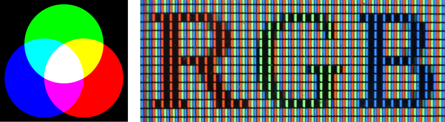
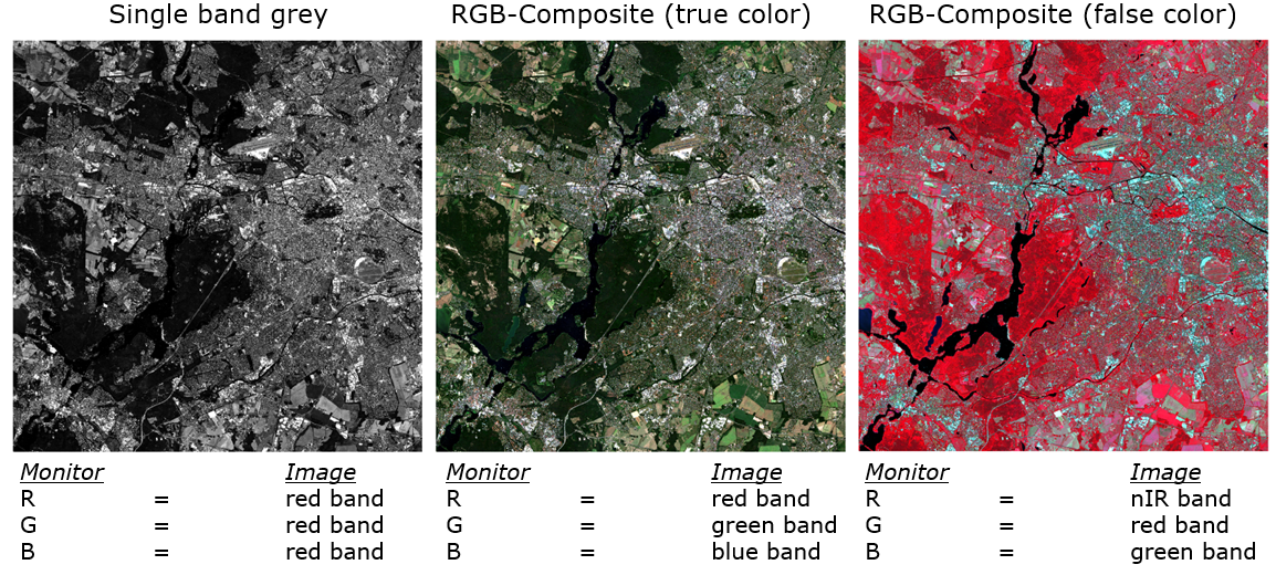
Remote sensing images can be presented differently using the RGB visualization capabilities of the monitor. Arbitrary bands can be displayed on screen in different RGB combinations, we therefore talk about RGB-composites. Sometimes we want to look at a single band only. In this case, we can visualize a grayscale image. Internally, this is realised by assigning all channels of your screen display (RGB) the same image band (e.g. red). This then leads to a grayscale gradient from black to white.
Exercise
With the LC08_L1TP_193023_20190726_20200827_02_T1_int16
file opened in QGIS, take a look at the Layers panel (by
default: bottom-left window in QGIS). Open the visualization setting by
right-clicking on the raster object and selecting
Properties or via double-click on the raster object.
Navigate to Symbology to display the visualization
settings:
- What is the default “Render type”?
- What is the current visualization, i.e. which bands correspond to which display channel (RGB)?
- Based on your previous observation, are we looking at a true- or false-colour image?
- How many bands are available for this image file?
Next, try to navigate to your place where you live. Why is this difficult even though you might have used Google Maps in satellite view for years?
Last, visualize the red band as single-band greyscale image (Symbology > Render type > Singleband gray).- How rich in contrast is the image? Can you still differentiate major spatial patterns (e.g. large roads, Spree)?
- What is minimum and maximum digital number (DN) that is assigned to completely black and white, respectively?
-
How does the image representation change when you set the maximum value
to
1500? -
Can you determine what the pixel values (e.g.
1500) measure? Hint: It is a ratio of energy, but the values were multiplied by factor of10,000. Accordingly, the1500are0.15on the original scale. But0.15what? Bananen, Birnen, Äpfel?
It appears the visualization of the single-band red band has very little contrast by default. We will now learn how to deal with low contrast appearance.
Contrast enhancement
If not specified otherwise, visualization software often assumes images contain pixel values of very low and very high intensity, althought this is often not the case with remote sensing imagery. Due to surface, recording and sensor conditions, data sets (or bands) often contain only lie between a limited range of obtainable gray values / DNs. Why? Because in theory they are designed to be able to measure objects with very little reflectance (e.g. deep water surfaces) to highly reflective sands in the Sahara desert.
Take a look at the histogram (the frequency distribution) of values measured in the red band of our image:
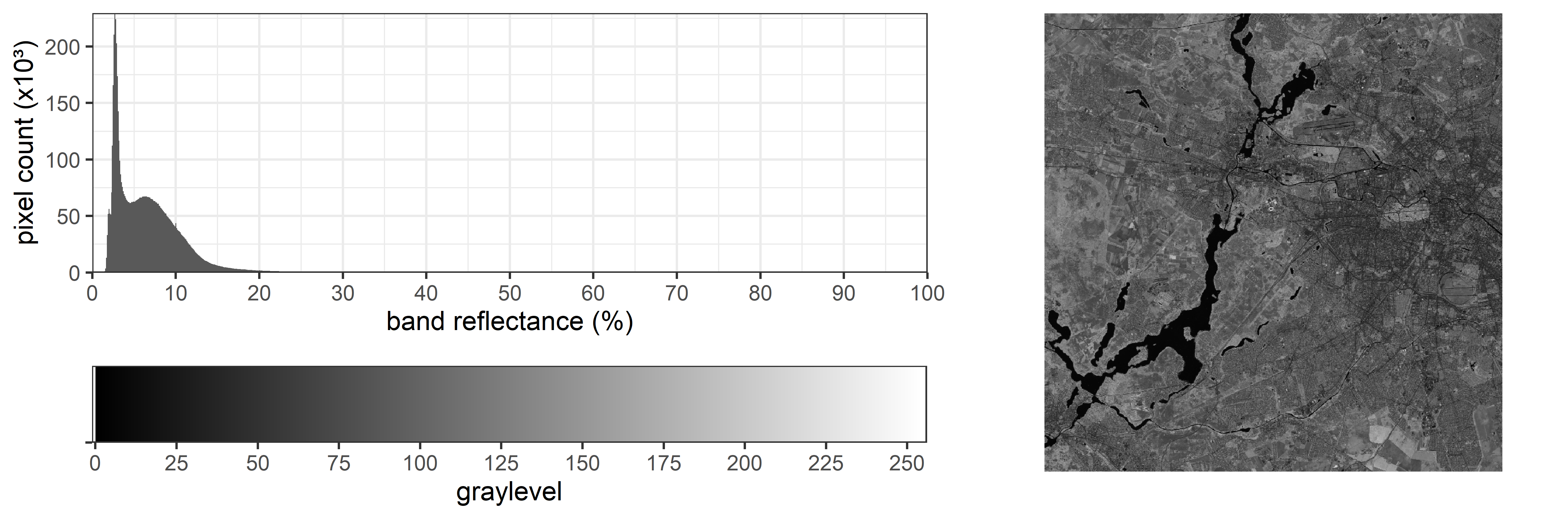
You can see that the vast majority of values lies below 10% reflectance. Standard computer screens each have a RGB color depth of 8-bit (equivalent to 256 graylevels). The transfer of pixel values to a monitor may occur initially 1:1 (compare the x-axes). In this setting, the images are often displayed in low-contrast to a degree where differences are virtually impossible to discern. Now QGIS, for instance, at least uses the calculated minimum and maximum value from the image to assign these values to 0 and 255 on the screen. Still, as you have seen in the exercise above, this may result in poor contrast:
We can see that our image mostly contains values at the lower end. The majority of pixels however has values below 20% reflectance, and we can see a peak of very low values of at ~3% reflectance. If we now choose to visualize the image without accounting for the image-specific distribution, we will see a dark image with poor contrast. Instead, we would like to utilize the full gray value range optimally.
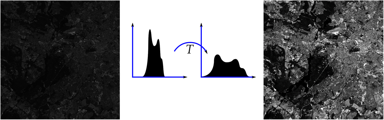
Contrast enhancement describes a function that is used to transfer pixel values into on-screen gray values. There different functions we can go on about this:
Often, linear contrast enhancement is used where the increase in gray value per increase in pixel value remains the same for the most relevant value ranges (top-row in figure above). We can achieve this by modifying the linear strech applied to the image, e.g. linear contrast stretch adjusted to the specific image statistics. We may calculate for example minimum and maximum value and apply a linear stretch between those values. As the extreme values (min & max) are very much influenced by outliers, we may prefer using specific percentiles (e.g. 2% and 98%), or stretch linearly between +/- two standard deviations from the mean. This may be called percentile stretch and helps to maximize the contrast within the most frequently occurring image values (bottom-row).
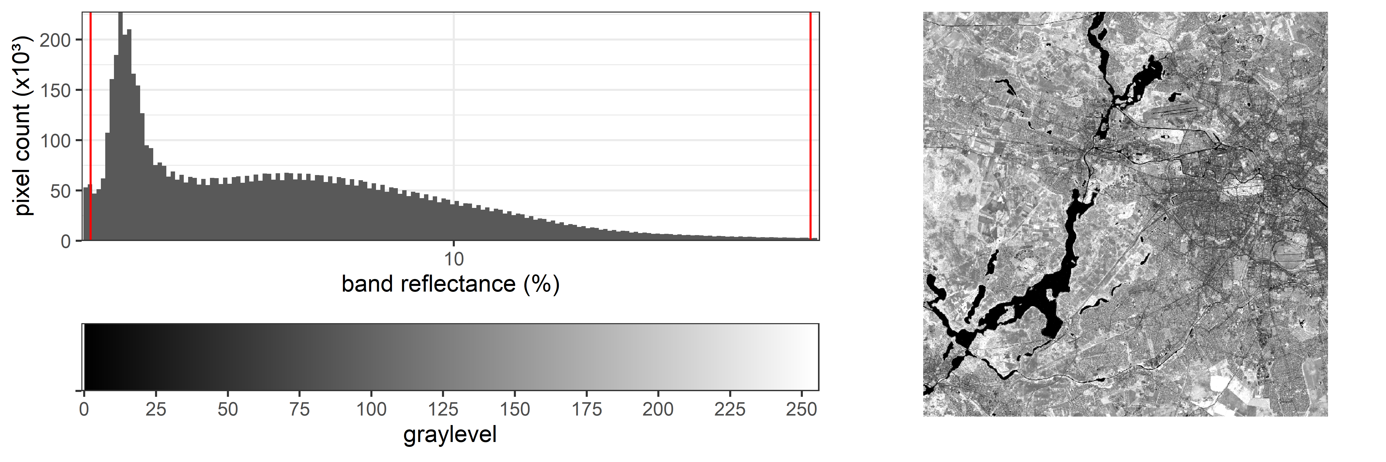
As an example, here we apply a linear stretch starting at the 2% percentile and ending at the 98% percentile. Compare the image contrast with the graph above:
There are more ways of applying contrast enhancement to an image. Keep in mind that all these techniques are only used to visualize images on screen. By applying them, only the screen visualization changes, the actual data remains the same (e.g. a measured 15% reflectance remains 15%).
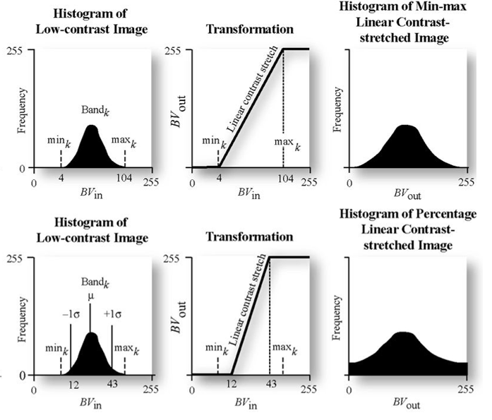
Linear contrast enhancement describes a function that is used to transfer pixel values into on-screen gray values to make use of the full value range that can be displayed. For this, a minimum and a maximum value in the original data is defined/calculated which then represent 0 (black) and 255 (white) on our computer screen. All pixels that fall between the minimum and maximum pixel values are linearily interpolated.
Exercise
With the above explanation of contrast enhancement in mind, switch to
the visualization settings and adjust the contrast (Properties >
Symbology > Min / Max Value Settings). Switch between
Min/Max and Cumulative count cut (leaving the
deault percentile values). Which is greater in contrast and why?
Next visualize the image as true-colour multi-band. By default the
Cumulative count cut should be active. Navigate to the
Grunewald. Can you easily discern water from the forest? Try to set the
Statistics extent (Min / Max Value Settings) from
Whole raster to Updated canvas. What is (also
given the wording) likely to happen here?
Assignment
The objective of this assignment is to get familiar with different RGB visualization of optical remote sensing images and to learn how different land cover types are represented in true- and false-color RGB-composites.
True- & false color RGB-composites
- Create a true and false color (R = nIR, G = red, B = green)
representation of the Landsat-8 image and answer the following
questions:
- What are the main visual differences between the true and false color representations?
- For what phenomena and/or surfaces does the nIR channel seem to be particularly sensitive?
To easily create and compare different band combinations for your raster image in QGIS, simply right-click on the image in the Layers panel and select
Duplicate Layer. Afterwards you can switch the band
combination for the new created raster layer in QGIS.
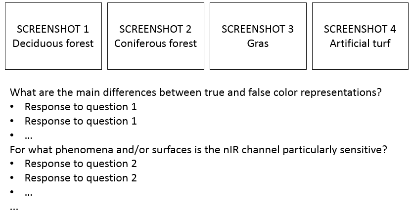
Visualizing surface types
- Find one example area for each of the following surfaces:
- Deciduous forest
- Evergreen forest
- Grass
- Artificial turf
- Provide a screenshot of each example area in true- and false-color
RGB-composite, answer the following questions:
- Are there visible differences between deciduous and evergreen forest?
- What are the differences between grass and artificial turf?
- Find a second false-color image band combination which could be
useful to visually distinguish different land cover surfaces:
- compare it to the true and other false-color band combination
- provide a screenshot of a region of your interest and describe the differences and similarities of the land covers between the different image band combination visualizations
- look for/think of a reason for the differences/similarities between the visualizations of the different band combinations
Submission
Document your answers to the questions above with bullet points and the help of your screenshots in PowerPoint, Word or another software package. Please use the following layout suggestion:
Upload your documentation as a PDF file on Moodle.
General submission notes: Submission deadline for the weekly assignment is always the following Monday at 10am. Please use the naming convention indicating session number and family name of all students in the respective team, e.g. ‘s01_surname1_surname2_surname3_surname4.pdf’. Each team member has to upload the assignment individually. Provide single file submissions, in case you have to submit multiple files, create a *.zip archive.
Test for Session 3: terra-package
Next week we start working with the terra-package in R.
This package is designed to handle large raster data sets and is
particularly useful for remote sensing data. To test your R+Rstudio
setup, we would like you to install the terra-package and
load a Landsat-8 image into R:
# install the terra package
install.packages('terra')

# load the package to get access to the package's routines/functions in your environment
library(terra)
Once the package is loaded into your current environment
(library(terra)), navigate to the Landsat-8 image you
worked with before, copy the absolute path to the .tif-file
and try to load the image into R. This should result in printing some
image properties to your console like shown below.
# create variable which contains the filepath
file_landsat8 <- "your/path/to/the/landsat8/file.tif"  # you have to adjust this path to the filepath on your system

# use the filepath to read in the file into a "rast()"-object
landsat_8 <- rast(file_landsat8)
print(landsat_8)
## class : SpatRaster
## dimensions : 1840, 2171, 6 (nrow, ncol, nlyr)
## resolution : 30.00639, 30.00728 (x, y)
## extent : 360793.1, 425937, 5794470, 5849683 (xmin, xmax, ymin, ymax)
## coord. ref. : WGS 84 / UTM zone 33N (EPSG:32633)
## source : LC08_L1TP_193023_20190726_20200827_02_T1_int16.tif
## names : BLU, GRN, RED, NIR, SW1, SW2
## min values : 639, 371, 227, 60, 23, 16
## max values : 5603, 5984, 6728, 7454, 11152, 8946If you see the output as above, you are ready for the next session. If you encounter any issues, please let us know via Moodle (describing the step that is not working and/or your error messages).
Copyright © 2023 Humboldt-Universität zu Berlin. Department of Geography.
![]()